

In this post I’ll go over some handy gallery design hacks you can use when implementing list of data in your canvas apps! We’ll look at both visual and non-visual based tips to improve the overall user experience of galleries in your apps!
An appropriate size and layout
One of the first important parts of designing the UI for a gallery, is to pick the size and layout carefully. I pick the size and layout of my galleries based on the context of the data that I am displaying.
If I am using a photo in my gallery to make visual items easy to see and select, I want to make sure the visual item is generally the focus of the gallery item in question, with additional detail around this focused image.
So, for a view of data such as menu items, or inventory where I want to display an image of the item, or object, I might choose to use a design like the one below.
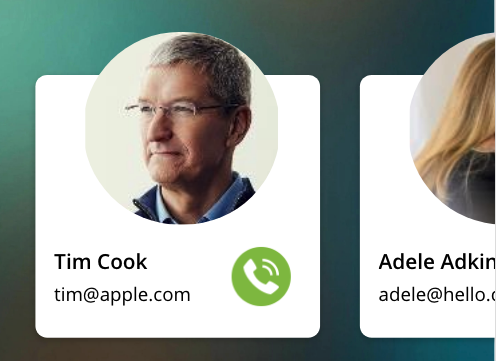
Here I’m displaying a view of people, where my focus is on those individuals, so I want to put the visual focus on my persons image here. You can see I’ve made the image take up the most space in my gallery, and I’ve made details take up less space.
You can also see that I’ve made the orientation of this gallery horizontal. I find that with these kind of views and layouts, horizontal galleries work a lot better. You might find though that if you have a long list of people to display, a horizontal gallery wouldn’t work so well.
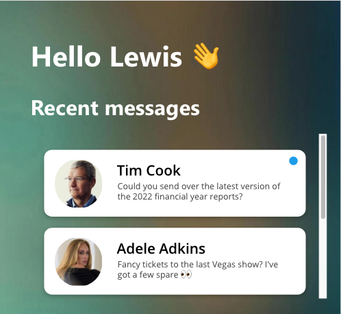
An alternative example of that, where I might have more data, could be messages. Here you can see I’ve arranged my data in a vertical gallery now which is easier to make work for greater numbers of records.
So, the first hack or tip here is to make sure you choose your orientation, sizing and layout correctly. If you’ve got a lot of data, horizontal galleries with a large template size might not be the best option, and a vertical gallery with a smaller template size might work better, but vice versa!
Make gallery items pretty with box shadows
The next tip here is to get out of that blocky design of having flat rectangles, or separator lines to separate records. Instead why not use some HTML text and a div container with some box-shadow in it’s style to give a softer cleaner look to separating records.
You can see in the images above I have a nice rounded white background to my records, with a bit of a shadow towards the bottom. To do this, I’m using the following box shadow style in a div container within a HTML text control.
border-radius:15px;margin:30px;box-shadow: rgba(0, 0, 0, 0.24) 0px 3px 8pxYou will also need some additional styling such as sizing, background-color, margin and border-radius to achieve the above result. This is the syntax I’ve used inside of my HTMLText property of my HTML text control.
"<div style= ""height: " & Self.Height -70 & "px; width: " & Self.Width -70& "px; background-color: white; border-radius:15px;margin:30px;box-shadow: rgba(0, 0, 0, 0.24) 0px 3px 8px;""></div>"And as you can see, I get a nice soft UI type look as a result of doing this! You might choose to take a different approach when styling a div container that still gives an awesome look but that might not be such a soft UI. You can do loads with this! 😍
You can find some awesome box shadows already made for you here!
93 Beautiful CSS box-shadow examples – CSS Scan (getcssscan.com)
Make galleries pop and push on hover
This tip is one that I’ll mention is dependent on the type of app you’re developing. If you’re developing an app to be used on mobile phones or tablet devices with a touchscreen, you won’t get the benefit out of this. However, if you’re developing a canvas app intended to be used on desktop devices such as a leave requests system people will access on their laptops, or it might even be an app that is completely responsive between devices where you only use this option on desktop devices, this then is a tip that can apply!
In canvas apps gallery controls, we have a property called ‘transition’. This basically lets us add some animation to our galleries when we hover over them. If you set transition to pop, the gallery item will pop out on hovering, and push will make the gallery item push into the screen when hovering…
Check this out…

Look how awesome that is! It gives our users some feedback when hovering over items making them seem clickable and interactive!
The invisible button!
My next tip is to layer a completely invisible button over the top of your gallery item. Why, you might ask?
By adding a button over the whole of our template space, it means that when a user hovers over the item, the mouse cursor will change from a mouse icon to a hand.
This again just gives our users some feedback when hovering over items making them seem clickable and interactive.
The coloured dot indicator!
My last tip is one tip, that comes with an issue, and a fix 😉
This tip is to take advantage of not always needing to add a text label with a field referenced to your gallery items which takes up loads of space and adds to potentially already existing clutter.
If you’ve got a case where you have things like a status column with only 3 choices, or a yes no column to show whether something is on or off, new or not new etc, this could be a great thing to use!
You can use this in two ways… but let me show you what I’m looking at first.

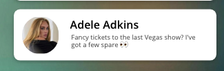
You can see I’ve got a little blue dot over here. This is what I’m talking about when I say the coloured dot indicator!
So, here’s a few ways you could use this…
- You could use this for those cases where you’re working with a boolean (0/1) (no/yes) and display a dot or just not display a dot. That way it’s very simple and you might only need one hard coded tooltip.
- You can use this where you’re switching the colour with a Switch() function based on a field value. So you might have 3 status’s… something like… New, In Progress, and Complete, lets say! You might make New as red, In Progress as amber, and Complete as Green. But what if users don’t know what these colours mean? This is problem A…
Fixing Problem A…
So to resolve the issue of people not knowing what a colour means, we can use the same kind of Switch() statement in our tooltip but replace the colour results with string results which can show our status label! Now people can hover over the indicator to see what it means!
Note: keep in mind this will only work on desktop devices where people can hover over things.Problem B…
So I’m not finished just yet… there’s a new problem now. Remember how we said we were going to layer that big button over our entire gallery template so it made our item appear clickable. Well that means there’s something over our indicator now blocking us from hovering over it to see a tooltip.
Hold on… I’ve got another resolution 😉
Fixing Problem B…
To fix this issue, all we now need to do is add another button which is completely invisible, so its still something that means the entire card appears clickable, but now we just need to completely replicate the size and position of our dot indicator which may be a circle control. Now we just need to add our Switch() function into the tooltip of our button! Now we have a completely clickable item again, and a tooltip for our indicator.
Reducing controls with an even better approach
Okay… I’m still not QUITE finished. The thing now is that we’ve added an additional control, which well, isn’t completely necessary. See you can just use your button control alone and style it like your dot indicator using the Fill property and a Switch() statement to achieve your visual goals. Then use your tooltip property to your hover goals, and all at the same time it’s already a button so it will appear clickable! 🎉
Overview
So… make sure you pick orientation, sizing and positioning carefully, make items pretty and divided with soft UI and box shadows taking advantage of the HTML text control, make galleries interactive with the transition property, keep in mind that visible button for interactivity, and finally think about using that indicator dot to remove clutter and simplify UI whilst still delivering information about a record!
I hope this post gave you a few cool tricks to improve the style of your galleries! If you have any other tips you’d like to share, or have any questions, be sure to leave them in the comments below 💖