

One of the many aspects to delivering a good user experience with solutions we develop, which in hand drives user adoption, is the user interface our users experience when interacting with our apps, and dashboards. In this blog post, we’re going to look at some of the things you can do to improve the user interface you design in your Power BI reports!
#1 – Brand
My first tip is to get a set of guidelines to work to! If you don’t have an existing idea about how your report will end up looking with regards to its theme, colour scheme, whether it has a soft UI, or a UI with more harsh box like edges, then you’re likely to produce something slightly inconsistent in itself, and something that almost certainly won’t match the brand you’re creating the report for.
Most companies will have a document outlining their brand guidelines. If you’re producing a report for a client, simply ask for their brand guidelines, and use them as guidance to various parts of the UI in your report. For example, take the HEX codes for brand colours out of the guidelines and use them appropriately for main colours, background colours, accent colours etc.
#2 – Inspiration
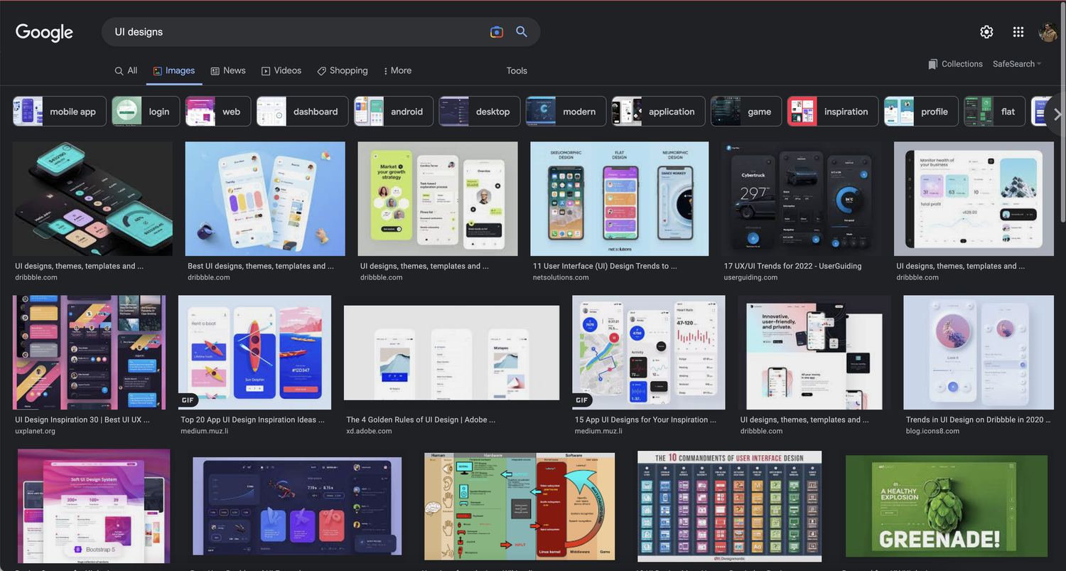
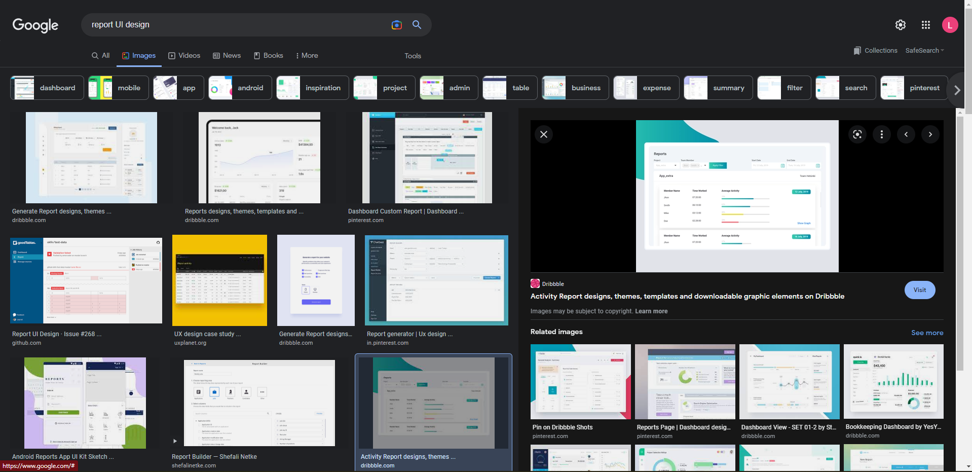
My next tip, which is one I apply to any user interface I design, is to take inspiration from other designs. Generally, this doesn’t mean I search for ‘Power Apps’ or ‘Power BI reports’, but instead I simply google ‘UI design’, or something like ‘report UI design’. This tends to return some fantastic examples of good UI design, which I like to take inspiration from, and elements from which I try to replicate in my reports.
#3 – Visualisations Effects
Another thing I tend to like to do in my reports is to take advantage of the out-of-box effects options against visualisations. To take advantage of these options, simply click on a visualisation, for example a ‘stacked bar chart’, and click the middle icon under the visualisations pane for ‘format your visual’.
From that pane, you can click the general tab and open the section for ‘effects’. In here we have 3 options which I like to take advantage of:
Background
Using the background option, I like to select a colour and set how transparent I want the background colour of that visual to be. Keep in mind branding and the colour scheme across your wider report when selecting this!
Visual Border
Using the visual border option, I generally don’t use this to make a visual coloured border around a visual, but you can if you like! Instead, I take advantage of the property to add rounded corners to a visual, I then set the colour to the same colour as the background so that you don’t see a visual border, but you do allow for a rounded soft UI type look.
Shadow
The final option in the effects section I take advantage of, and that is available, is the shadow options! I generally set this to a dark colour and set the offset as outside with the position as bottom right. Use the properties to make your report work for you! This allows you to further create a nice soft UI, with a bit of a 3D pop on your visuals.
#4 Theming
If you’re struggling slightly with keeping your report consistent in it’s colours, why not just not edit them and select a theme! Head to the ‘view’ tab in Power BI where you can select a theme and see your report and visuals all change to match it!
Not only can you select a theme in Power BI, but you can also browse for other themes online, customise and save your own theme! If you’re looking to roll out more consistent branding in your organisation across reports, take advantage of the option to create your own theme and share it with your report makers!
#5 – Alt Text & Tooltips
A final tip to improve the user interface in your Power BI reports, is to ensure that you don’t unintentionally exclude users because you haven’t built your UI with accessibility in mind.
By adding alt text to your visualisations, you allow users with sight impairments to experience your report.
To add alt text to a visualisation, head back to a selected visual, go to the format your visual pane, select the general tab, and open the ‘alt text’ option.
Anything that you add into the alt text section will be read by a screen reader when the visualisation is selected. You can use conditional formatting in your alt text too!