

In part 3 of this series on building an app to search for cocktails based on an alcohol or spirit, we’re going to look at styling our app at the current point it is in to make it look a little more modern and eye catching for our users. After all if we don’t consider elements of UI, we’re going to have an effect on the wider UX of an application and in turn it’s user adoption.
It’s also important that we remember that UI isn’t just GUI. It is also other ways people interact with our application such as by using a screen reader and a keyboard only. However, in this post, I’m going to focus on some tips on styling your app to improve it’s GUI.
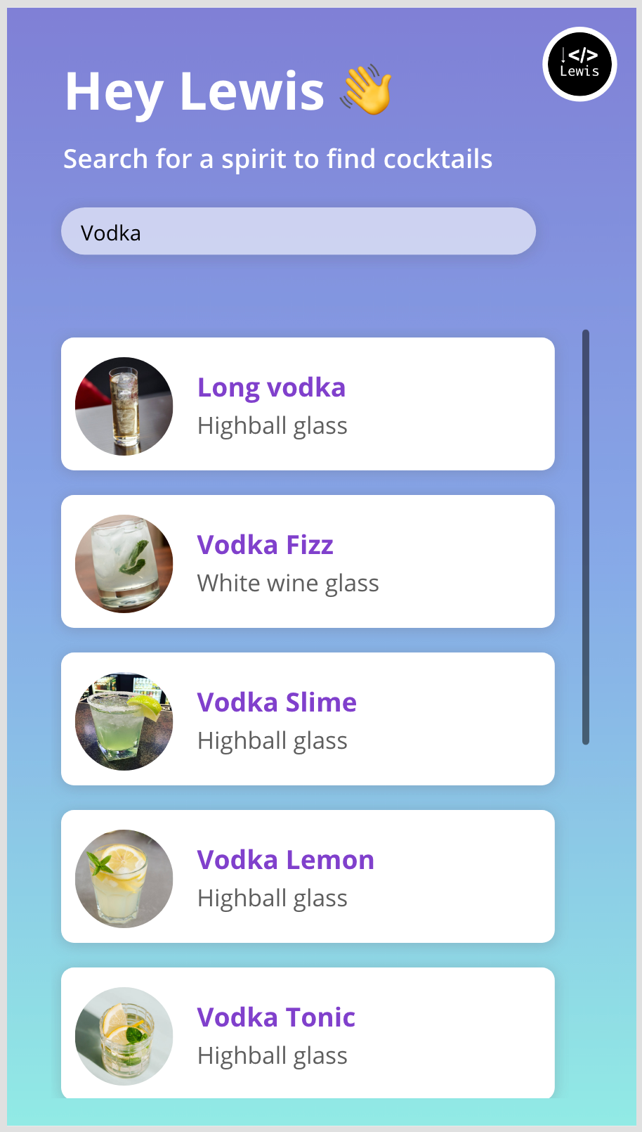
My app
So let’s first look at what I’ve achieved in terms of styling my application. This didn’t take long remember so there’s loads more you could do with your application, this is just a getting started example.
So, there you have it! That’s what I’ve designed in the canvas studio to build out what I think is a pretty eye catching application. Now we’ll take a look at a few simple tips to achieve this look.
The background
Now for my background there are two ways of achieving this. Either we can just use a jpg file and our screens background property to do this. Or we can use some CSS to render a gradient on the screen. In my case I have just used a simple jpg file for ease of explanation, so hopefully you find this easier to achieve too.
I like to use the website below to find gradient images quickly. This website provides both CSS snippets and jpg files for you to use so you pick how you’d like to implement things! 🙂
uiGradients – Beautiful colored gradients
The search box
The next thing that looks a little nicer than an out the box control is the search input box. Let’s see how to achieve this look.
Effectively what I have here is a HTML text control with some content in it to produce the look of this input box, and then I have layered an input box over the top of it which is completely transparent so that it looks like the nice HTML underneath it but still has the functionality of a text input. The text is obviously not transparent though.
Here is the HTML and inline styling I used to display my search box.
"<div styleheight:" & Self.Height - 25 & "px; width:" & Self.Width -25 & "px; background-color:rgba(255,255,255,0.6); box-shadow:rgba(100, 100, 111, 0.24) 0px 2px 14px 2px; border-radius:50px; margin:10px""></div>"Simply pop that into a HTML text control and size it how you wish. The HTML will dynamically change size to the size of your control. Once you’ve done that just add a text input control over the top and set its fill and colour properties to be transparent.
The gallery
Now let’s take a look at the styling of the gallery…
To build the background of each card which is white with rounded edges and a nice drop shadow, I’ve used a HTML text control and the following HTML and inline styling to achieve this…
"<div style = ""height:"&Self.Height - 25&"px;width:"&Self.Width -25&"px; background-color:white; box-shadow: rgba(100, 100, 111, 0.24) 0px 2px 14px 2px;border-radius:13px;margin:10px""></div>"Then I’ve done nothing more than adding an image control to display my cocktail image with the border radius set to display my image as a circle. Set this as high as you need depending on your image size to ensure it displays as a circle.
Then I’ve simply added a primary text label using bolder font weight and a bolder colour to produce the main text which is the name of my drink. Then for secondary text which is where I want to display the glass to use I’ve used a lighter font weight with a less bold colour.
For more gallery design tips check out this post…
Overview
That’s it! At this point in the series we’ve looked at interacting with the API we need to use, we’ve taken a look at bringing some data into Power Apps using a Power Apps triggered Power Automate cloud flow, and finally we’ve taken a look at styling our first app screen nicely to deliver a nice UX for GUI users.
If you haven’t understood anything at this point in the series, let me know in the comments below and I’ll do my best to provide more help!