

Are you frequently building reports in Power BI to be used by others? Chances are in your group of users there’s people who have accessibility needs whether you’re aware of the fact or not!
In this blog post I’ll give you 5 tips to making your Power BI reports more accessible.
If you like this content, be sure to subscribe to my blog to get daily updates on blog posts.
SubscribeAlt text
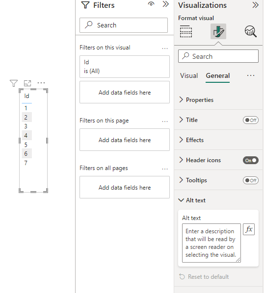
My first tip, is to add alt text to the visualisations you add to your reports. This is super simple to do and means that users who rely on screen readers get a detailed description of the visualisations you’ve added to your report.
The great part about alt-text in Power BI, similar to the likes of Power Apps, is that it doesn’t have to be hard coded or static. You’re able to use conditional formatting in alt text.
To add alt-text to your Power BI report visualisations, simply select the visualisation, then in the format visual pane, select the general tab and add your alt text under the alt text dropdown.
Tab order
For users that rely on a keyboard to tab through interfaces, it’s really important to make sure that your reports support this by setting correct tab order.
Being someone that works slightly more with Power Apps than Power BI, I’ve noticed that tab order in each of the products works slightly differently. In Power Apps its more common to just use -1 as a value on a control if a control shouldn’t be recognised by a tab, and its appropriate to use a 0 if it should, with the positioning of the control then being relied on as to when the tab highlights on that control.
It’s not recommended in Power Apps to setup custom tab orders using numbers greater than 0, i.e. using 1 on a first control, then 2 on a second.
However, in Power BI the setup of tab order happens in a completely custom order sense. To configure the tab order of visualisations in Power BI, simply head to the view tab in Power BI desktop when building your report, then select the ‘Selection’ button in the command bar.
You’ll then see the selection pane open with tab order as a tab you can select to configure the tab order of visualisations in your report.
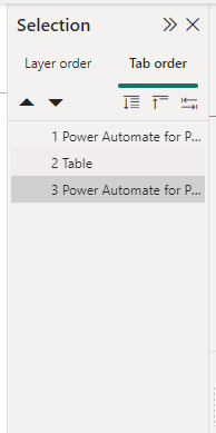
To change the order visualisations are tabbed to when using a keyboard, simply select the visualisation in the list, then move it up and down in the list. This will change the order of your tab index in your Power BI reports making them accessible to users who rely on tabbing through interfaces when they aren’t able to interface using an input device such as a mouse.
Colour contrasting
This is a point that sort of applies to any platform you build when building a GUI (graphical user interface), and isn’t an exception when it comes to building a Power BI report of visualisations.
Ensuring you’re complying with colour contrasting standards as per the WCAG is really important to make your reports accessible to users who are colour blind or who have low vision.
Your text and background colour and differentiations between colour on your report should have a contrast ratio of at least 4.5:1 to match the WCAG 2.1.
Not sure whether you’re matching these guidelines? Make sure you use an accessibility checker such as this one to check! Color Contrast Checker – TPGi (paciellogroup.com)
Add titles and labels
Another tip is to ensure you add titles and labels to your visuals making them more easily understandable. This includes the following:
- Add titles to your visuals
- Label keys in your visualisations
- Add labels to X and Y axis of graphs if applicable
- Ensure hover features include the correct information by changing the visualisations properties
Decorative items
For any decorative items you include in your report, ensure that you remove these from the tab order in your report so that any users relying on this don’t feel as if they’re navigating through an overly cluttered report of branding and jargon with little actual value through helpful visualisations.
Only add tab index to the interactive elements on the screen which matter i.e. slicers and visualisations.
Overview
So main idea is to ensure you maintain good enough colour contrasting, add alt-text, configure tab order and remove unnecessary jargon, and add titles and labels to describe elements in your report!
Didn’t understand something in this post, just let me know your question in the comments below.